Since the Conquest of America, Peru has played a central role in the modern culinary history of the world, particularly with its key contribution of the potato (of which the country cultivates more than 3000 varieties), a symbol that has been marginalized from the Euro- and anglo-centric discourses of modernity. It is appropriate, then, that Peruvian artists and activists revindicate a similar autochthonous crop–purple corn and its popular fermented, liquid form, chicha morada–as a symbol of identity and rebellion. Though its history as such a symbol reaches back to the early 20th century, it was in the 1980s that the popular purple drink–most popular among the pueblo, or the lower class, and synonymous with indigenous culture–became a rallying call for Peruvian artistic autochthony and social justice.
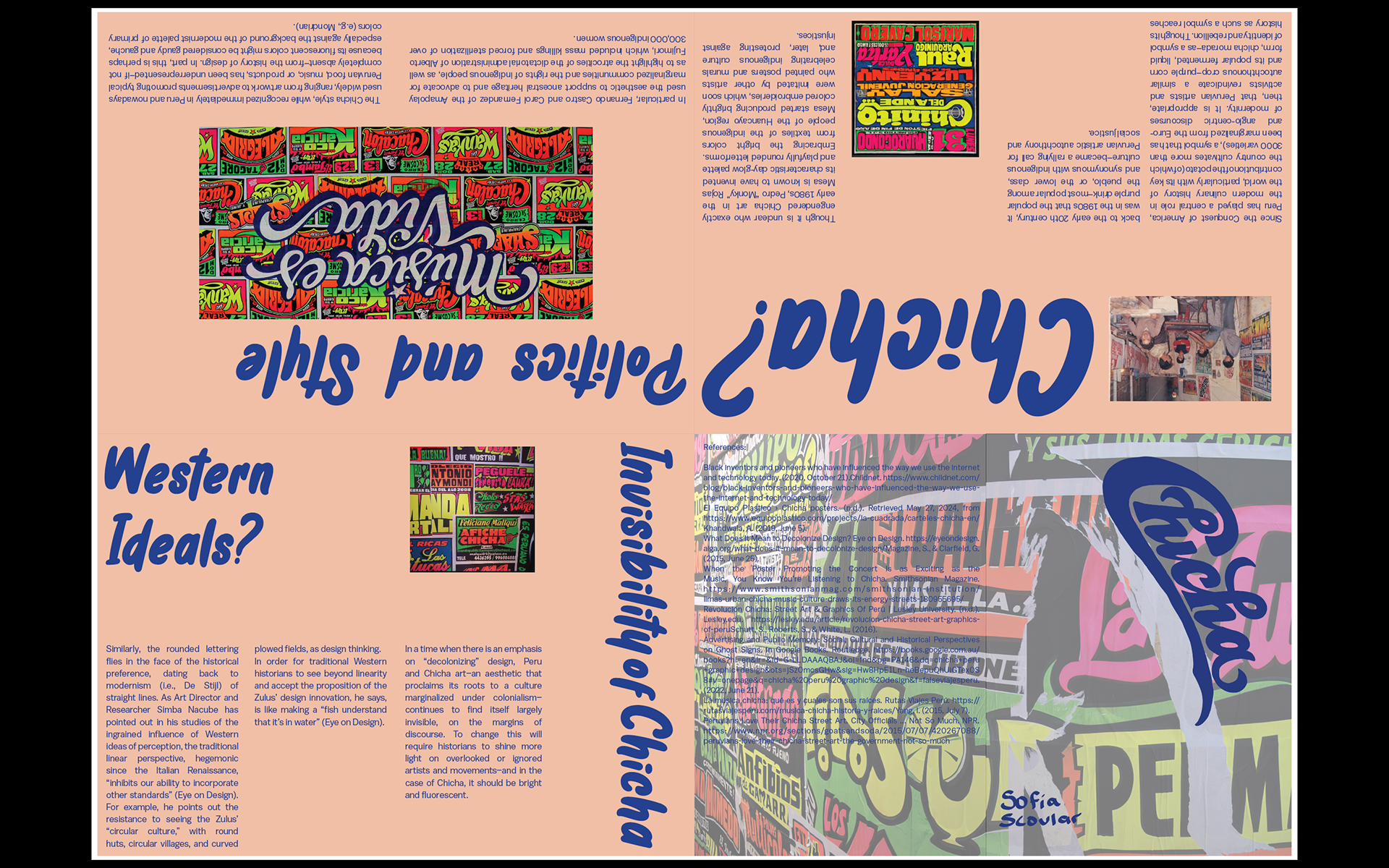
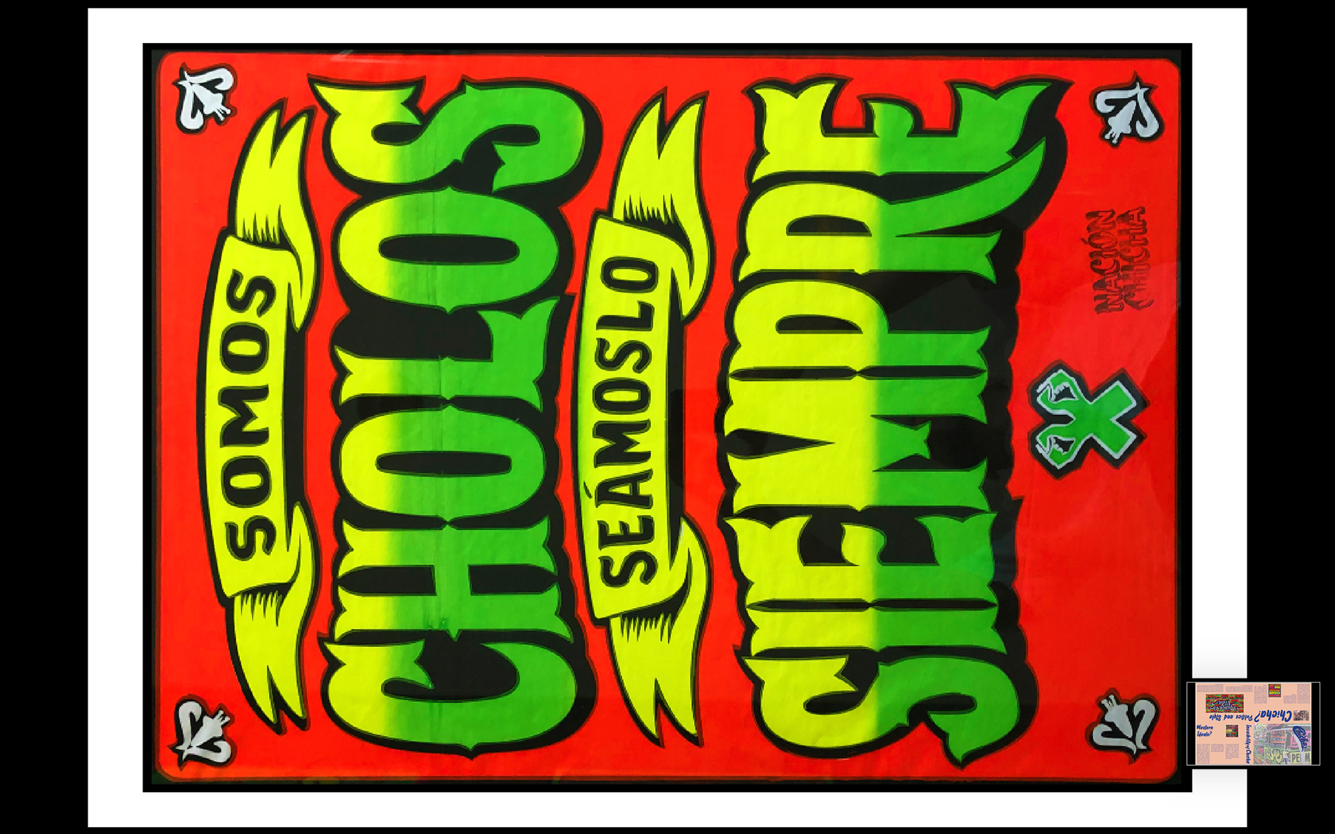
Though it is unclear who exactly engendered Chica art in the early 1980s, Pedro “Monky” Rojas Mesa is known to have invented its characteristic day-glow palette and playfully rounded letterforms. Embracing the bright colors from textiles of the indigenous people of the Huancayo region, Mesa started producing brightly colored embroideries, which soon were imitated by other artists who painted posters and murals celebrating indigenous culture and, later, protesting against injustices. In particular, Fernando Castro and Carol Fernandez of the Amapolay used the aesthetic to support ancestral heritage and to advocate for marginalized communities and the rights of indigenous people, as well as to highlight the atrocities of the dictatorial administration of Alberto Fujimori, which included mass killings and forced sterilization of over 300,000 indigenous women.
The Chicha style, while recognized immediately in Peru and nowadays used widely, ranging from artwork to advertisements promoting typical Peruvian food, music, or products, has been underrepresented–if not completely absent–from the history of design. In part, this is perhaps because its fluorescent colors might be considered gaudy and gauche, especially against the background of the modernist palette of primary colors (e.g., Mondrian). Similarly, the rounded lettering flies in the face of the historical preference, dating back to modernism (i.e., De Stijl) of straight lines. As Art Director and Researcher Simba Nacube has pointed out in his studies of the ingrained influence of Western ideas of perception, the traditional linear perspective, hegemonic since the Italian Renaissance, “inhibits our ability to incorporate other standards” (Eye on Design). For example, he points out the resistance to seeing the Zulus’ “circular culture,” with round huts, circular villages, and curved plowed fields, as design thinking. In order for traditional Western historians to see beyond linearity and accept the proposition of the Zulus’ design innovation, he says, is like making a “fish understand that it’s in water” (Eye on Design).
In a time when there is an emphasis on “decolonizing” design, Peru and Chicha art–an aesthetic that proclaims its roots to a culture marginalized under colonialism– continues to find itself largely invisible, on the margins of discourse. To change this will require historians to shine more light on overlooked or ignored artists and movements–and in the case of Chicha, it should be bright and fluorescent.